
To create a cohesive color scheme in your kitchen, start by selecting a base color that sets the overall tone. Consider how light affects your space and choose complementary or accent colors to add depth and interest. Use the 60-30-10 rule to balance your palette, with 60% as the dominant color, 30% as the secondary color, and 10% as accents. Don't forget to incorporate textures and materials through countertops, backsplashes, and cabinetry finishes. Balance warm and cool tones to achieve the desired atmosphere, whether it's energetic or calming. By understanding color psychology and following these principles, you'll be well on your way to designing a stunning kitchen.
Understanding Kitchen Color Psychology
In the world of kitchen design, color plays a crucial role in shaping the room's atmosphere and functionality. Understanding kitchen color psychology can help you create a space that not only looks great but also affects your mood and behavior.
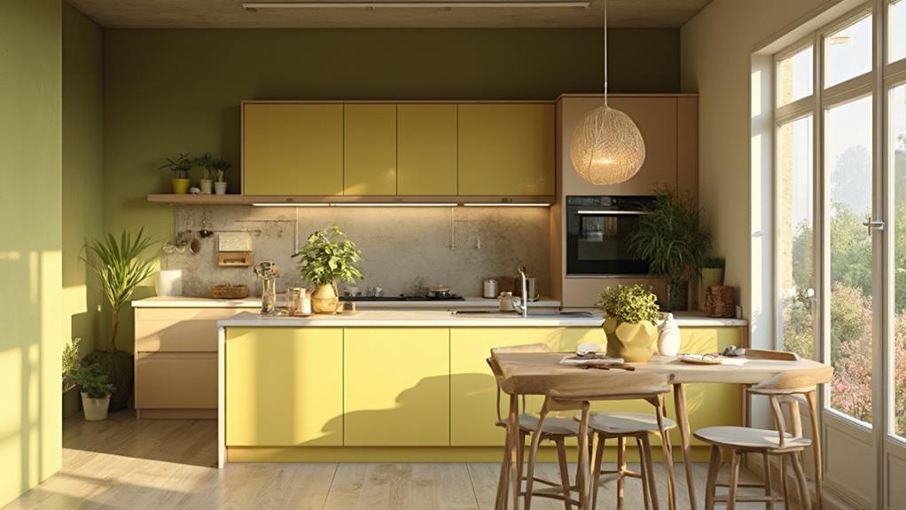
Warm colors like red, orange, and yellow are known to stimulate appetite and encourage social interaction. They're ideal for creating a lively, energetic atmosphere in your kitchen. However, be careful not to overuse them, as they can be overwhelming in large quantities.
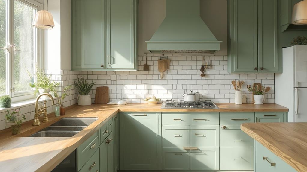
Cool colors such as blue, green, and purple have a calming effect and can make your kitchen feel more spacious. They're excellent choices for promoting relaxation and focus, which is perfect if you spend a lot of time cooking or working in your kitchen.
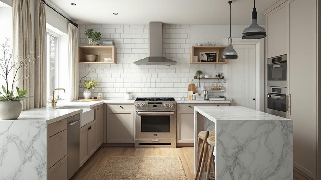
Neutral colors like white, gray, and beige provide a versatile backdrop that allows you to experiment with accent colors. They can make your kitchen feel clean, modern, and timeless.
Consider the natural light in your kitchen when choosing colors. Darker kitchens may benefit from lighter shades to brighten the space, while well-lit kitchens can handle darker, more dramatic hues.
Choosing Your Base Color
Selecting your base color is the foundation of your kitchen's color scheme. This color will dominate the space and set the tone for the entire room. When choosing your base color, consider the size of your kitchen and the amount of natural light it receives. Lighter colors can make small spaces feel larger and brighter, while darker hues create a cozy atmosphere in larger kitchens.
Look at your existing elements, such as flooring, countertops, and appliances. Your base color should complement these features. Neutral tones like white, beige, or gray are versatile options that work well with various styles and allow for easy accessorizing. If you're feeling bold, consider a muted version of your favorite color as your base.
Don't forget to test your chosen color in different lighting conditions. Paint large swatches on your walls and observe how they look throughout the day. Remember that colors can appear different depending on the light source, so it's crucial to see how your base color performs in natural daylight and under artificial lighting. Once you've settled on your base color, you'll have a solid foundation for building your kitchen's cohesive color scheme.
Complementary and Accent Colors
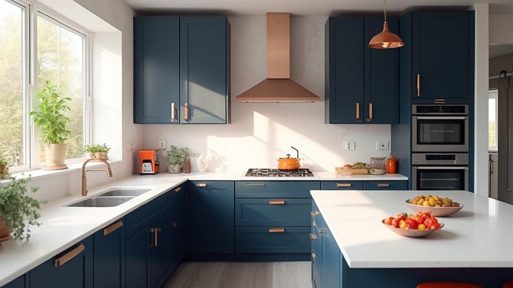
With your base color established, it's time to explore complementary and accent colors to enhance your kitchen's visual appeal. Complementary colors sit opposite each other on the color wheel, creating a bold contrast. For example, if you've chosen a blue-gray base, consider warm oranges or yellows as accents. These pops of color can be introduced through accessories, small appliances, or even a feature wall.
Accent colors should be used sparingly to avoid overwhelming the space. Aim for a 60-30-10 rule: 60% base color, 30% secondary color, and 10% accent color. You can incorporate these colors through various elements like backsplashes, countertops, or cabinet hardware.
Don't forget about neutral tones to balance your color scheme. Whites, beiges, or light grays can help soften bold color combinations and create a more harmonious look. When selecting complementary and accent colors, consider the natural light in your kitchen and how it might affect color perception throughout the day. Test paint samples and fabric swatches in different lighting conditions before making final decisions. Remember, your goal is to create a cohesive and inviting space that reflects your personal style while maintaining visual harmony.
Balancing Warm and Cool Tones
Temperature balance is crucial when creating a cohesive color scheme in your kitchen. Warm tones like reds, oranges, and yellows can make your space feel inviting and energetic, while cool tones like blues, greens, and purples create a calm, refreshing atmosphere. To achieve harmony, you'll want to incorporate both warm and cool colors in your kitchen design.
Start by identifying your dominant color temperature. If you've chosen warm-toned cabinets or flooring, balance them with cool-colored walls or backsplashes. Conversely, if your main elements are cool, add warmth through accessories or accent pieces. You can also use neutral colors like whites, grays, and beiges to bridge the gap between warm and cool tones.
Consider the natural light in your kitchen when balancing temperatures. North-facing rooms tend to have cooler light, so you might want to add warm elements to counteract this. South-facing kitchens often benefit from cooler tones to balance the warm sunlight. Don't forget about your lighting fixtures, as they can significantly impact the perceived temperature of your color scheme. By carefully balancing warm and cool tones, you'll create a visually appealing and comfortable kitchen space.
Incorporating Texture and Materials
Texture and materials play a crucial role in creating a cohesive color scheme in your kitchen. They add depth, interest, and visual appeal to your space, complementing the colors you've chosen. When selecting materials, consider how they'll interact with your color palette and overall design.
Start by choosing your countertops, as they're a significant element in your kitchen. Granite, quartz, or marble can introduce natural patterns and textures that tie your color scheme together. For backsplashes, consider textured tiles, glass, or stone to add dimension.
Don't overlook the importance of cabinetry finishes. Smooth, glossy surfaces reflect light differently than matte or textured finishes, affecting how colors appear. Wood grains can also introduce warm tones and natural textures.
Incorporate metallic elements through hardware, light fixtures, or appliances. These can add shine and contrast to your color scheme. Consider mixing metals for a more eclectic look.
Textiles like curtains, rugs, or upholstered seating can soften the space and introduce additional textures. Choose fabrics that complement your color palette while adding visual interest.
Conclusion
You've got all the tools to create a stunning kitchen color scheme. Coincidentally, as you're reading this, your perfect palette might be right in front of you. Look around – that fruit bowl or favorite mug could inspire your entire design. Remember, it's your space, so trust your instincts. With a balanced mix of colors, textures, and materials, you'll craft a kitchen that's not just beautiful, but uniquely yours. Now go ahead and make your culinary dreams a reality!