
When choosing colors for your kitchen, consider their psychological impact. Red can stimulate appetite and create excitement, while blues and greens promote calmness and tranquility. Yellows and oranges infuse energy and warmth, encouraging conversation and boosting mood. Neutral tones provide balance and adaptability, making spaces feel larger and brighter. Complementary color combinations inject visual interest but require careful balance. Each hue affects your emotions and behavior differently, so select wisely based on the atmosphere you want to create. Your kitchen's color palette can transform it from a mere cooking space into a mood-enhancing, appetite-stimulating haven. Explore further to unlock the full potential of color in your kitchen design.
The Power of Red
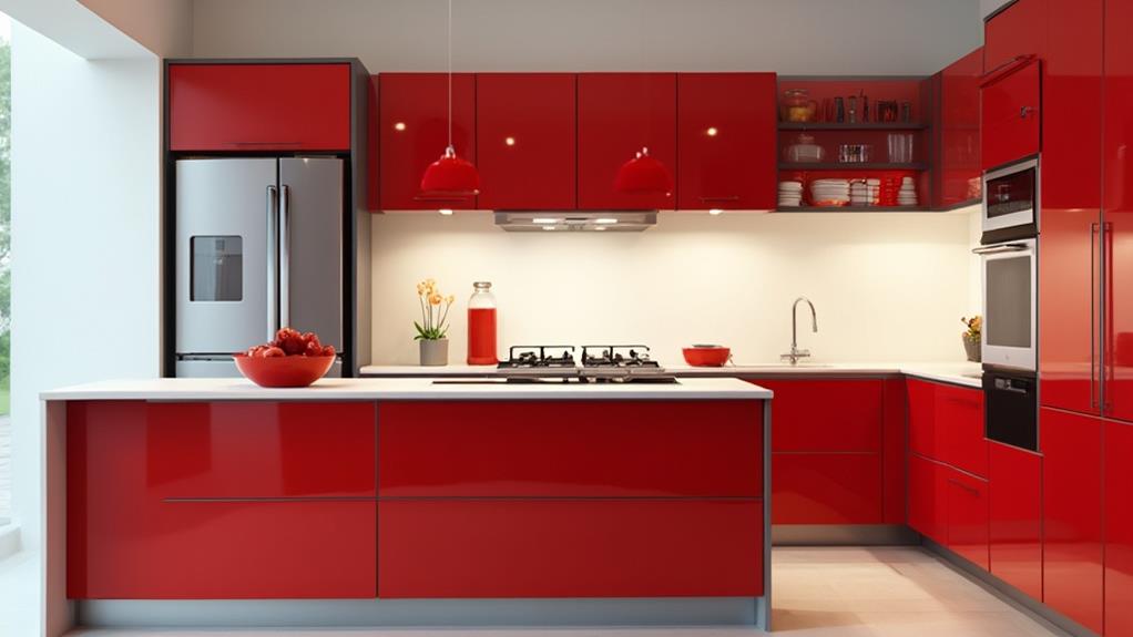
Passion, energy, and appetite-stimulation—red wields a powerful influence in kitchen design. When you incorporate this bold hue into your culinary space, you're tapping into primal instincts and cultural associations that can dramatically affect mood and behavior.
Red's intensity can increase heart rate and blood pressure, creating a sense of excitement and urgency. In a kitchen, this can translate to increased productivity and enthusiasm for cooking. It's no coincidence that many fast-food chains use red in their branding; the color has been shown to stimulate appetite and encourage eating.
However, use red judiciously. Too much can be overwhelming and create anxiety. Consider using it as an accent color on a feature wall, in backsplash tiles, or through small appliances and accessories. You can also explore various shades of red, from deep burgundy to bright cherry, to find the right tone for your space.
Red pairs well with neutral colors like white, gray, or beige, creating a balanced and sophisticated look. It also complements wood tones, adding warmth to natural elements in your kitchen. By strategically incorporating red, you'll create a dynamic and inviting kitchen that energizes and inspires.
Calming Blues and Greens
A serene oasis awaits those who incorporate blues and greens into their kitchen design. These cool hues can transform your cooking space into a calm retreat, perfect for unwinding after a long day. Blues evoke feelings of tranquility and stability, reminiscent of clear skies and deep oceans. They're ideal for creating a soothing atmosphere, especially in high-stress areas like the kitchen.
Greens, on the other hand, bring nature indoors and promote a sense of balance and harmony. They're associated with growth, renewal, and freshness – qualities you'll want to embody in your culinary creations. You can use various shades of blue and green to achieve different effects. Lighter tones like sky blue or mint green can make your kitchen feel more spacious and airy, while deeper hues like navy or forest green add sophistication and depth.
Consider incorporating these colors through painted cabinets, backsplashes, or accent pieces. You don't need to go all-in; even small touches of blue or green can significantly impact the overall feel of your kitchen. Remember, the key is to create a balance that suits your personal style and promotes a relaxing environment for cooking and gathering.
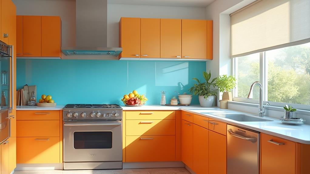
Energizing Yellows and Oranges
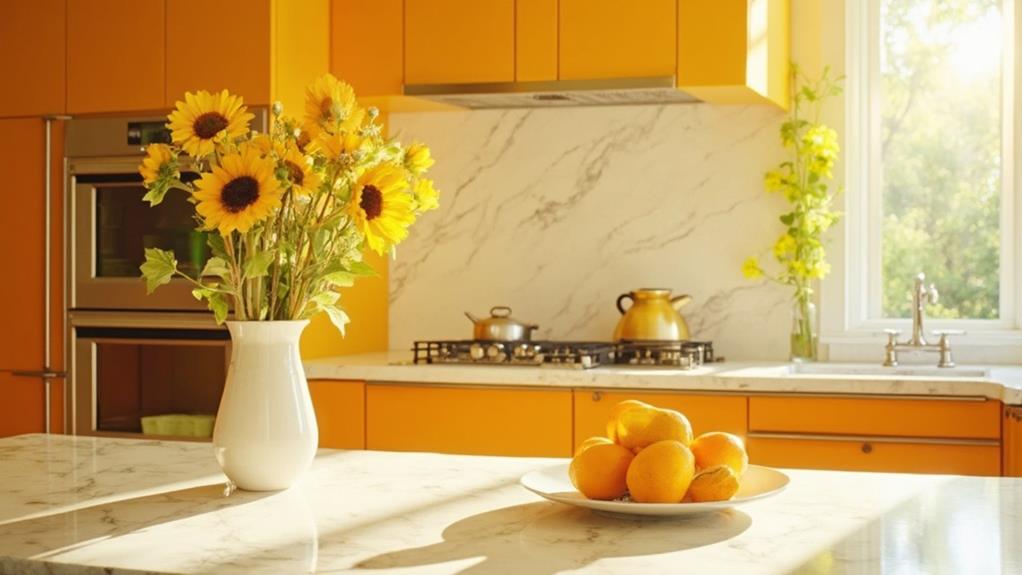
While cool colors can create a calming atmosphere, you might want to infuse your kitchen with energy and warmth. Yellow and orange are perfect choices for achieving this effect. These vibrant hues stimulate appetite, encourage conversation, and boost mood, making them ideal for social kitchens.
Yellow, reminiscent of sunshine, promotes optimism and clarity. It's an excellent choice for smaller kitchens, as it can make spaces appear larger and brighter. Consider using yellow for walls, cabinets, or even as an accent color in tiles or accessories. However, use it judiciously, as too much yellow can be overwhelming and create anxiety.
Orange, a blend of red's energy and yellow's cheerfulness, adds a cozy and inviting feel to your kitchen. It's particularly effective in breakfast nooks or dining areas within the kitchen. You can incorporate orange through painted walls, backsplashes, or kitchen appliances. For a subtle approach, use terracotta or peachy tones. Remember that warm colors advance visually, so they can make large kitchens feel more intimate. Balance these energizing hues with neutral tones to create a harmonious and welcoming kitchen design.
Neutral Tones for Balance
Neutral color palettes provide a calming counterpoint to vibrant hues in kitchen design. When you're looking to create a balanced, timeless atmosphere, consider incorporating shades of white, beige, gray, or taupe. These versatile tones can serve as a backdrop for bolder accent colors or stand alone for a clean, sophisticated look.
White kitchens remain popular for their ability to make spaces feel larger and brighter. They're also highly adaptable, allowing you to easily change accent colors or decor without a major overhaul.
Warm neutrals like cream or soft beige can add warmth and coziness to your kitchen while maintaining a sense of calm.
Gray tones offer a modern alternative to traditional neutrals. They range from light, airy shades to deep, dramatic hues, giving you flexibility in creating the desired ambiance. Taupe, a mixture of gray and brown, can bridge the gap between cool and warm tones, offering a harmonious blend.
When using neutral tones, pay attention to texture and material variations to add depth and interest to your kitchen design. Mixing matte and glossy finishes or incorporating natural elements like wood can prevent a neutral palette from feeling flat or monotonous.
Complementary Color Combinations
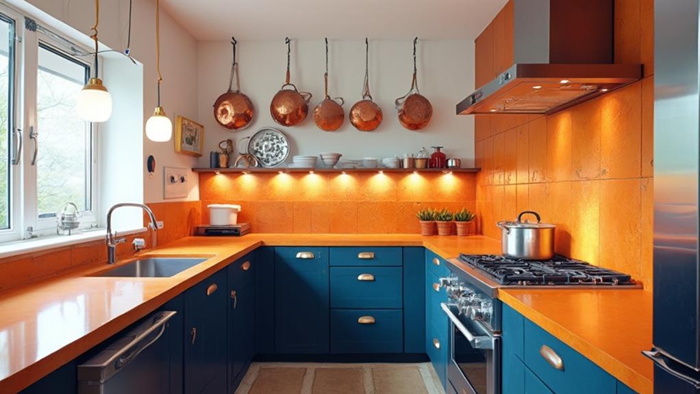
Moving beyond neutrals, complementary color combinations can inject energy and visual interest into your kitchen design. These pairings, found opposite each other on the color wheel, create a striking contrast that can elevate your kitchen's aesthetic appeal. Popular combinations include blue and orange, purple and yellow, or red and green.
When implementing complementary colors, it's crucial to maintain balance. Use one color as the dominant shade and the other as an accent. For example, you might choose blue cabinets with orange backsplash tiles or countertop accessories. This approach prevents the space from feeling overwhelming or chaotic.
Consider the psychological effects of your chosen colors. Blue promotes calmness and cleanliness, while orange stimulates appetite and sociability. Purple evokes luxury and creativity, whereas yellow brings warmth and cheerfulness. Red increases energy levels, and green symbolizes nature and renewal.
To incorporate complementary colors effectively, start small. Use decorative elements like curtains, rugs, or artwork to introduce the accent color. As you grow more comfortable, you can expand to larger surfaces like walls or cabinetry. Remember, the goal is to create a harmonious space that reflects your personality and enhances your cooking experience.
Conclusion
You've explored the vibrant world of kitchen color psychology. You've learned how red ignites passion, blues and greens soothe the soul, yellows and oranges energize your space. You've discovered the balance of neutrals and the power of complementary combinations. Now, armed with this knowledge, you can transform your kitchen, elevate your mood, and create a space that's uniquely yours. Choose your palette wisely, and watch your kitchen come alive with color and personality.