
To create a cohesive color scheme in your bathroom, start by understanding color theory basics and choosing a primary color that suits your style and the room's characteristics. Consider the emotional impact of colors, with cool tones promoting calm and warm hues energizing the space. Incorporate complementary or accent colors through accessories and small painted areas to add depth and interest. Balance warm and cool tones using the 60-30-10 rule, and don't forget how textures and materials influence color perception. By carefully considering these elements, you'll be well on your way to designing a harmonious bathroom retreat that reflects your personal taste and enhances your daily routine.
Understanding Color Theory Basics

To create a cohesive color scheme in your bathroom, you'll need to grasp the fundamentals of color theory. Start by familiarizing yourself with the color wheel, which displays primary, secondary, and tertiary colors in a circular arrangement. Primary colors (red, blue, and yellow) can't be created by mixing other colors. Secondary colors (green, orange, and purple) result from mixing two primary colors. Tertiary colors are created by combining a primary and an adjacent secondary color.
Understanding color relationships is crucial. Complementary colors sit opposite each other on the wheel and create high contrast. Analogous colors are next to each other and offer a harmonious look. Triadic colors are evenly spaced around the wheel and provide a balanced, vibrant scheme.
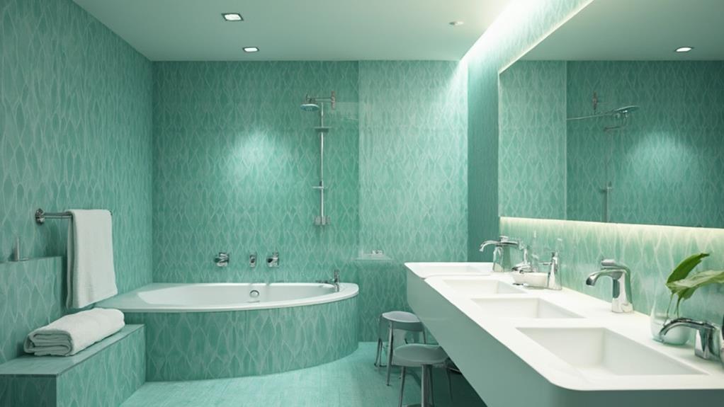
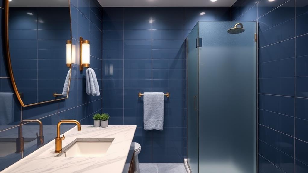
Consider the emotional impact of colors. Cool tones like blues and greens can create a calming atmosphere, while warm hues like reds and yellows energize a space. Neutrals such as white, gray, and beige can serve as a backdrop or balance bolder colors.
Keep in mind the 60-30-10 rule: use your dominant color for 60% of the room, a secondary color for 30%, and an accent color for 10%. This approach ensures a well-balanced and visually appealing bathroom design.
Choosing Your Primary Bathroom Color
Now that you've grasped the basics of color theory, it's time to select the primary color for your bathroom. This choice will set the tone for your entire space, so consider it carefully. Start by assessing the room's natural light and size. Darker colors can make a small bathroom feel cozy but might overwhelm the space, while lighter hues can create an airy, expansive feel.
Think about the mood you want to create. Blues and greens evoke a calming, spa-like atmosphere, while warmer tones like yellow or peach can energize the space. Don't forget to factor in existing elements like tiles, fixtures, or countertops that you can't easily change.
Consider your personal style and the overall design of your home. Your bathroom should feel cohesive with the rest of your living space. If you're unsure, try picking a color from a favorite towel or piece of artwork as inspiration.
Test your chosen color with paint samples or swatches before committing. View them at different times of day to see how the light affects the shade. Remember, you can always adjust the intensity by selecting lighter or darker variations of your chosen hue.
Complementary and Accent Colors
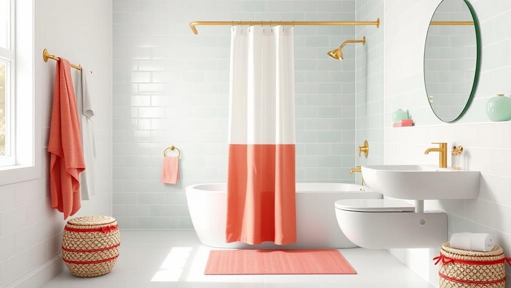
Once you've chosen your primary bathroom color, it's time to consider complementary and accent colors. These hues will add depth, interest, and balance to your bathroom's color scheme. To find complementary colors, look at the opposite side of the color wheel from your primary color. For example, if you've chosen blue as your main color, orange-based hues will complement it nicely.
Accent colors should be used sparingly to create focal points and add visual interest. Choose one or two accent colors that work well with your primary and complementary colors. You can introduce these through accessories, towels, or small painted areas. For a cohesive look, consider using different shades of your primary color as accents.
When selecting your color palette, keep in mind the bathroom's size and lighting. Lighter colors can make a small space feel larger, while darker hues create a cozy atmosphere. Natural light will affect how colors appear, so test your choices in the actual space before committing. Don't forget to consider existing elements like flooring or fixtures when choosing your complementary and accent colors to ensure a harmonious overall design.
Balancing Warm and Cool Tones
When creating a cohesive color scheme, balancing warm and cool tones is crucial for achieving a harmonious bathroom design. Warm tones, like reds, oranges, and yellows, evoke a sense of coziness and energy, while cool tones, such as blues, greens, and purples, promote relaxation and serenity. To strike the right balance, consider using a 60-30-10 rule: 60% dominant color, 30% secondary color, and 10% accent color.
Start by choosing a dominant color temperature for your bathroom. If you've opted for warm-toned tiles or walls, incorporate cool-toned accessories or fixtures to create contrast. Conversely, if your main elements are cool-toned, add warmth through textiles or decorative items. You can also use neutrals like white, gray, or beige to bridge the gap between warm and cool tones.
Don't forget about lighting, as it can significantly impact color perception. Warm lighting can enhance warm tones and soften cool ones, while cool lighting can make cool colors appear more vibrant. By carefully considering the interplay between warm and cool tones, you'll create a balanced and inviting bathroom space that feels cohesive and visually appealing.
Textures and Materials in Color
Beyond color selection, textures and materials play a crucial role in creating a cohesive bathroom color scheme. When choosing finishes, consider how they'll interact with your chosen colors. Glossy surfaces reflect light differently than matte ones, affecting the perception of color. For instance, a high-gloss white tile will appear brighter and more reflective than a matte white tile.
Incorporate various textures to add depth and interest to your color scheme. You can use textured tiles, woven baskets, or plush towels to introduce subtle color variations. Natural materials like wood or stone can bring warmth and organic hues to your bathroom. A wooden vanity or stone countertop can complement your color palette while adding texture.
Don't forget about metal finishes on fixtures and hardware. Brushed nickel, chrome, or brass can influence your overall color scheme. Choose finishes that harmonize with your chosen palette. For example, warm brass tones pair well with earthy colors, while cool chrome complements blues and greens.
Lastly, consider the texture of your walls. Textured wallpaper, grasscloth, or even a subtle plaster finish can add dimension to your color scheme without overwhelming the space.
Conclusion
You've now got the tools to create a stunning bathroom color scheme. Remember, it's all about balance and harmony. Don't be afraid to experiment, but keep in mind that 60% of homeowners prefer neutral colors in their bathrooms. Whether you're going bold or subtle, your chosen palette will set the tone for your daily routine. With these tips, you'll transform your bathroom into a cohesive, inviting space that reflects your personal style.